When it comes to developing your website there are lots of aspects that you have to be sure of. One of the most important aspects is that your website is responsive. A responsive webpage is one that can be displayed without errors or the page being distorted on any device regardless of the screen size or resolution.
Why is it important to have a responsive webpage?
The number of devices that can now access the internet has dramatically increased in the past decade. As a result, mobile phones of all sizes, tablets, laptops and desktops can now all search and access your website. Yet, if your website’s design is only suitable for display on one screen size, the look will be distorted on others.
This can have a negative impact on the success of your store. Your site being responsive is very important for search engines. If your site is responsive, then you will rank higher and this will translate into higher levels of traffic and more sales on your site.
In addition, if your site isn’t responsive, then when those using a screen size that your site doesn’t support arrive, they’ll be more likely to abandon your store. Stores have seen conversion rates more than double when they’ve had a responsive website.
For example, O’Neill Clothing doubled revenues on iPhones and iPods whereas they increased sales on Android by nearly 600%. Skinny Ties improved revenues made from iPhone users by 377%.
Time Magazine saw usage of their website significantly increase when they made their website responsive. Their pages per visit, number of unique visitors and time spent on the website all saw significant improvements. In addition, the mobile user bounce rate of the site dropped by 26%.
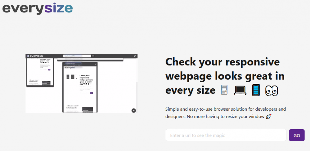
How to check whether your website is responsive
One of the big challenges is knowing whether or not your webpage is responsive. Most developers use a desktop and without having access to numerous devices, it’s hard for them to check that the site is truly responsive. If the developer does have all these devices, the process is also long and the solution to fix any responsive issues is not there.
This is where a tool like everysize becomes incredibly helpful. This tool allows a URL to be inserted and then converts the webpage into every size possible. These are created in iframes, which can be used on the website servers, to display the correct size when someone accesses a website.
If you would like to know more about everysize, you can check it out here.